
How do we perceive colour? Which hues help us work better or boosts our creativity, and which colour soothes us on stressful days?
by Chrystal Chan
Losing him was blue like I’d never known, missing him was dark grey, all alone… but loving him was red, goes a line from the song Red by Taylor Swift. In the eyes of dreamy songwriters and novelists, colours are intrinsically tied to emotions. Red, as the colour of love, and blue, the colour of misery.
Outside of creative expression, however, can colour actually influence mood?
“Perhaps,” says Assoc Prof Ng Woon Lam from the School of Art, Design & Media. “There’s no conclusive answer to that, even though much scientific research was done on it about 100 years ago at Bauhaus, a German art school.”
Colour associations have prevailed, largely due to our shared experiences, says Assoc Prof Ng.
“For example, when the sun is shining strongly outside, we can see brighter colours like yellow, orange and red better. However, when it is overcast, these bright hues lose their chroma, or intensity, and the world somehow looks duller. It also gets colder. As such, blue and grey tend to seem colder than orange and red.”
Not surprisingly, this is why we might think a blue flame is not as hot as a bright orange flame, but as chemistry lessons have taught us, blue flames are as hot as or even hotter than orange ones.
What science can tell us is that colour is a subjective experience created by our brains. Colour is simply light of different wavelengths. However, what you perceive as red or green is also affected by the environment in which the colour appears.
“Green might look red in one context and yellow in another. When you see colour, your brain is trying to determine whether you are seeing the object’s own hue or a combination of that and the amount of light that has fallen on it.”
Asst Prof Gerrit Maus, a cognitive scientist from NTU’s School of Social Sciences
Think of the difference between a photo taken indoors and outdoors. The photo taken outside is more cool-toned than the one shot indoors. “Your brain will still register a blank sheet of paper as white in both situations as it will automatically compensate and adapt to the light source,” says Asst Prof Maus.
It is still entirely possible for your brain to play tricks on you – who can forget the viral white and gold (no, black and blue!) dress in 2015 that set off a whirlwind of scientific theorising? Scientists are still unable to explain why so many people saw its colour so differently, but this much is clear: Colour is really all in the mind.
Red

Not just the colour of passion, red is also about excitement and energy. “This is probably why the logos of many sports-related companies, such as F1, ESPN and Puma, are red,” says Asst Prof Zhang Kuangjie, a consumer psychology expert from the Nanyang Business School.
“Red also tends to make food seem more appetising, so you’ll see many fast food chains with red logos,” he adds.
A 2007 study cited in the Journal of Experimental Psychology found that red is closely linked to performance. Students taking a five-minute test were given red, green or black participant numbers and it was found that students who received the red number scored 20 per cent lower than everyone else. In other research experiments, however, red boosted performance on tasks such as memory recall and proofreading, so the verdict is out on this one.
Blue

This is a shade that portrays trustworthiness. Banks and big corporations such as Facebook, United Overseas Bank and IBM use blue to convey dependability and stability.
Blue also portrays relaxation and serenity, which makes it a commonly used colour for waiting rooms, says Asst Prof Zhang. Other studies have shown that blue boosts creativity so crack that assignment in a blue room or dress your room with blue fittings.
Green
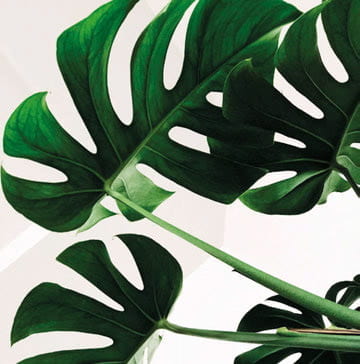
Considered nature’s colour, it evokes a sense of health, wellness and tranquillity. It is likely that health food companies or brands promoting an eco-friendly lifestyle will use green in their logos or packaging. In some research studies, green has also been associated with reduced stress and muscular tension, so take a walk around our lush garden campus after class when you can.
Pink
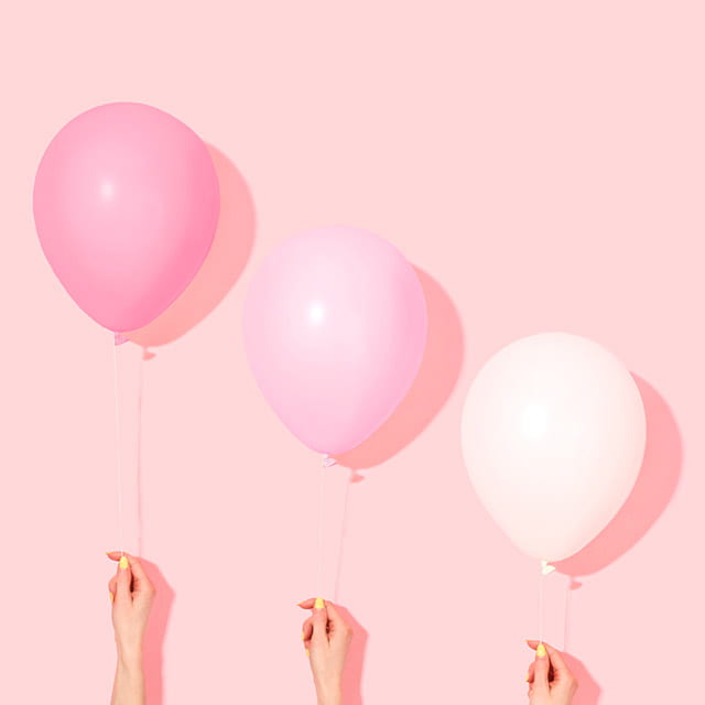
Well-known as a colour that represents femininity today, pink used to be a colour for boys in the early 19th century. It is now associated with love, kindness and women.
“If you want your house or room to look bigger, pick a pastel shade for the walls. Brighter colours help give an illusion of a larger space,” says Assoc Prof Ng.
Black
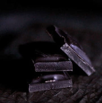
From the days of yore, black has been closely linked to immorality and wickedness. Today, this shade has much more positive associations. According to Asst Prof Zhang, black can help increase desire for something, especially if it is a guilty pleasure, like chocolate cake.
Build your dream room
Apart from judicious use of colour, there are other ways to enhance your mood, says cognitive neuroscientist Assoc Prof Georgios Christopoulos. The Nanyang Business School scientist and his team, which includes environmental psychologist Dr Adam Roberts, found that the state of your room can lead you to study for longer periods.
“We found that respondents were 2.5 times more persistent in solving puzzles and found boring tasks easier if their desk was enclosed. The opposite could be true for creative problem-solving, as stimulation can improve your ability to think out of the box,” he says.
Assoc Prof Christopoulos has taken his research on environmental psychology further with the help of a new virtual reality (VR) software his team developed. With a VR headset and psychological assessment tools that measure attention, focus, decision-making and fatigue, researchers can now determine how a room’s environment can improve productivity. The software will come in handy for offices, as rooms can be furnished and tried out virtually before being constructed.
This story was published in the Oct-Dec 2019 issue of HEY!. To read it and other stories from this issue in print, click here.